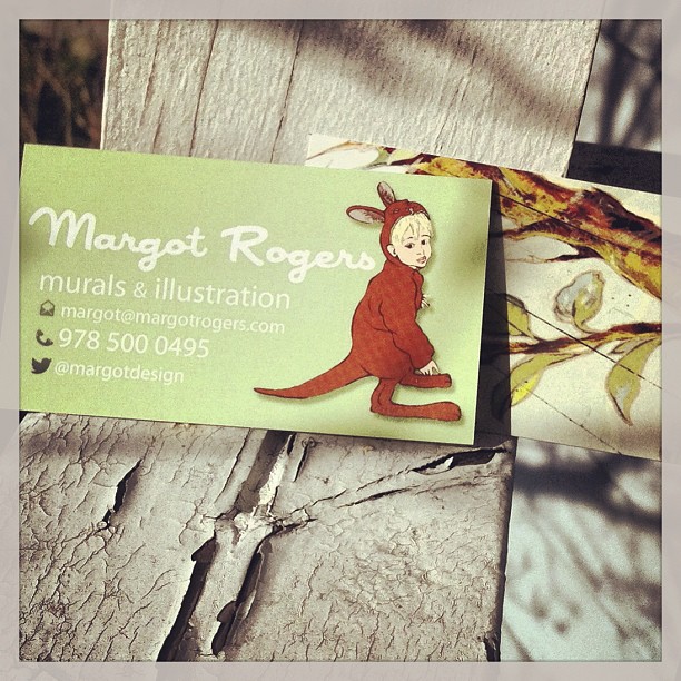
So excited for Spring! As a business spring cleaning gesture I ordered new business cards. After much deliberation and professional advice, I bit the bullet and ordered from Vistaprint using a Groupon. Yesterday my double sided Business cards came in, with an illustration on the front and a mural on the back. I’m thrilled with the result!
Most of my favorite illustrations are painted as murals on the sides of buildings, which is how I came to explore the wide world of illustration and mural painting all at the same time. Whether I am working on an editorial illustration, a how-to/DIY piece or illustrating a children’s book,  I am always thinking of how it could operate on a larger scale. I love the conversation between small and large, painted and digital that is going on in the art world right now.
My favorite part of making this business card was orchestrating the design so that the front (digital illustration) and back (photograph of a 40 foot floor mural) could play off each other in terms of color and style, and yet still be speaking the same language.
Here are my 7 tips for ordering business cards from personal experience:
1. I searched for a Groupon. However you do it, try to find a deal on a bulk order of cards so you don’t have to keep re-ordering.
2. Don’t be a penny pincher; be sure to get double sided cards.
3. Create a design that integrates the front and back sides, make sure that the colors coordinate.
4. Be sure to sit with the design for a while and make sure it “says” what you want it to. Get feedback on the design and message.
5. Using symbols for different modes of communication really helps. Many people benefit from making professional connections on Twitter, so it is a smart move to include your user name on the cards. However, you should clarify with a symbol that @margotdesign is your twitter name, or else some people who don’t tweet may confuse your twitter name for your email.
6. Avoid writing too much on the card, less is more in elevator pitches and business cards alike.
7. Make sure you use 2 fonts or less. Visually setting your name or business name apart with its own font is a good idea, but 3 fonts kills the simplicity of the card.

Do you have a space where the digital elements and the tangible are overlapping? Where they are in dialogue or discord? Let me know your experience in the comments below, I’d love to hear your perspective!